Monday 8 November 2010

Upgrading a great website

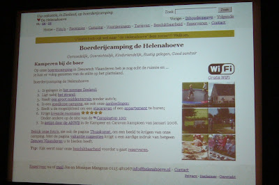
Last year I was at the award ceremony of the Usability Awards 2010. For the website www.helenahoeve.nl there was a honorable mention. During this ceremony I learned some things to improve the website.

This is what I have done:

  1. Changed the font from serif to sans-serif.
    This change has some impact. The top menu was too large now, so 
  2. I had to remove a menu item in the top menu.
    Luckily did this change improve the readability. Due to this change I was able to
  3. Display a darker background.
    Both the old and the new backgroumd was based on a picture of grass. With the new background that is more clear.
    In the bottom menu was the call for action: "Make a reservation now"
  4. I have replaced the call for action in the bottom menu into: "Check availability".
    This is a more inviting call for action. Of course the goal of the website is that people makes reservations, so 
  5. I made clear call to action buttons for "Make a reservation".
    For the call to action buttons I used the same grass background as for the top and bottom menu. It looks really nice.
  6. The text of the bottom menu is modified a little due to the fact there is another call to action now.
  7. At the page "reviews" and "back at home" I have a clear call to action to write a review.
  8. At the contact page there are even three call to action buttons now.
    "Make a reservation", "Write a review" and "Mail".
  9. Very important is of course the call to action button "Make a reservation" at the page "Availability".
  10. At the page "Availability" I have changed the text a little. I includes now the phrase "now" to create an urgency to make a reservation.
  11. The HTML code is upgraded form XHTML 1.0 to HTML 5 for all pages.
    The most important feature of HTML 5 is that you are now able to use
  12. A placeholder for all "text" fields.
  13. The appropiate fields are changed from "text" to "email", "url", "search".
  14. Some fields are marked as required now.
I believe that these small changes improve the usability of the website.

Wednesday 6 October 2010

The Belgian Usability Awards 2010

For the Belgian Usability Awards 2010 are the following sites nominated:
  1. www.uitinvlaamsbrabant.be
  2. www.kdg.be
  3. www.newpharma.be
  4. www.mobistar.be
  5. www.toerismevlaamsbrabant.be
  6. www.agsob.be
  7. www.middelkerke.be
  8. www.kriskras.be
  9. www.connections.be
  10. www.sibelga.be
The scores according to the Dutch Web Guidelines are:
  1. www.uitinvlaamsbrabant.be 38 points;
  2. www.kdg.be 37 points;
  3. www.newpharma.be 35 points;
  4. www.mobistar.be 34 points;
  5. www.toerismevlaamsbrabant.be 34 points;
  6. www.agsob.be 40 points;
  7. www.middelkerke.be 31 points;
  8. www.kriskras.be 37 points;
  9. www.connections.be 29 points;
  10. www.sibelga.be/nl 37 points.
None of these sites got the same score as www.helenahoeve.nl (41 points).


The validation results of these sites are:

  1. www.uitinvlaamsbrabant.be Not valid, 6 errors;
  2. www.kdg.be Not valid, 15 errors, 2 warnings;
  3. www.newpharma.be Not valid, 19 errors;
  4. www.mobistar.be Not valid, 1 error;
  5. www.toerismevlaamsbrabant.be Not valid, 14 errors, 21 warnings;
  6. www.agsob.be Not valid, 2 errors;
  7. www.middelkerke.be Not valid, 81 errors, 3 warnings;
  8. www.kriskras.be Not valid, 27 errors, 2 warnings;
  9. www.connections.be Not valid, 32 errors, 19 warnings;
  10. www.sibelga.be/nl Not valid, 1 error.
Unlike the Helenahoeve none of the candidates validate.

The loadtime of these sites are:

  1. www.uitinvlaamsbrabant.be 7.9 seconds;
  2. www.kdg.be 10.7 seconds;
  3. www.newpharma.be 0.5 seconds;
  4. www.mobistar.be 0.6 seconds;
  5. www.toerismevlaamsbrabant.be 7 seconds;
  6. www.agsob.be 10.4 seconds;
  7. www.middelkerke.be 2.2 seconds;
  8. www.kriskras.be 5 seconds;
  9. www.connections.be 4.7 seconds;
  10. www.sibelga.be/nl 5.3 seconds;
How liguid are the designs (when does the horizontal scrollbar appear on a 1024x768 screen):

  1. www.uitinvlaamsbrabant.be 1 x "CTRL +";
  2. www.kdg.be 1 x "CTRL +";
  3. www.newpharma.be 1 x "CTRL +";
  4. www.mobistar.be 0 x "CTRL +"!;
  5. www.toerismevlaamsbrabant.be 0 x "CTRL +"!;
  6. www.agsob.be 1 x "CTRL +";
  7. www.middelkerke.be 0 x "CTRL +"!;
  8. www.kriskras.be No horizontal scroll at all!;
  9. www.connections.be 1 x "CTRL +";
  10. www.sibelga.be 1 x "CTRL +";
Is it easy to contact the organisation. Is there a real e-mail address or a contact form.

  1. www.uitinvlaamsbrabant.be  no e-mail address, there is a contact form;
  2. www.kdg.be  e-mail address, no contact form;
  3. www.newpharma.be  no e-mail address, there is a contact form;
  4. www.mobistar.be  no e-mail address, there is a contact form wizard;
  5. www.toerismevlaamsbrabant.be  e-mail address and contact form;
  6. www.agsob.be  e-mail address and contact form;
  7. www.middelkerke.be  e-mail address, no contact form;
  8. www.kriskras.be  e-mail address, no contact form;
  9. www.connections.be e-mail address, but no link to the promised contact form;
  10. www.sibelga.be  no e-mail address, there is a contact form;
So at the end I think that non of these sites should win the usability award seen from a technical perspective. When I browse the sites I think the winner will be www.uitinvlaamsbrabant.be

Monday 28 June 2010

Click Through Rate

Based on Google Webmaster Tools for the period 26 May - 24 June 2010 the Helenahoeve got the following Click Through Ratings:


minicampings zeeuws vlaanderen 57%
cadzand haaientanden 48%
boerencamping zeeuws vlaanderen 43%
boerencampings zeeuws vlaanderen 43%
haaientanden zoeken 43%
campings in zeeuws vlaanderen 40%
molka spel 38%
campings zeeuws vlaanderen 36%
struisvogeleieren te koop 35%
camping zeeuws vlaanderen 29%
haaientanden cadzand 28%
molka 24%
minicamping zeeuws vlaanderen 23%
goedkope stacaravan huren 20%
goedkoop kamperen 15%
helenahoeve 14%
fotospeurtocht 11%
bowlen cartoon 11%
camping zeeland goedkoop 11%
paardenmelkerij 11%
privacy 11%
meeste zonuren nederland 11%
minicamping cadzand 11%
boerderijcamping zeeland 10%
zonuren nederland 9%
boerencamping zeeland 7%
trampoline ingraven 7%
struisvogelboerderij 6%
boerencampings zeeland 5%
havenfeesten terneuzen 4%
trampoline 2%
jeu de boules 2%
dolfinarium 2%
dolfinarium brugge 2%
haaientanden 1%
boerderijcamping 1%

Top 20 of search terms used

The top 20 (actual 22 due to some ties) of used search terms based on Google Webmaster Tools for the period 26 May - 24 June are:
  1. trampoline
  2. haaientanden
  3. boerencamping zeeland
  4. jeu de boules
  5. camping zeeuws vlaanderen
  6. campings zeeuws vlaanderen
  7. dolfinarium
  8. boerderijcamping
  9. havenfeesten terneuzen
  10. boerderijcamping zeeland
  11. goedkoop kamperen
  12. kleine kinderen
  13. speurtocht
  14. struisvogelboerderij
  15. fotospeurtocht
  16. trampoline springen
  17. zeeuws vlaanderen
  18. bowlen cartoon
  19. camping zeeland goedkoop
  20. dolfinarium brugge
  21. helenahoeve
  22. het zwin

Search terms which appear at position 1, 2, 3

Based on Google Webmaster Tools for the period 26 May - 24 June 2010 there where 894 search terms used. 282 of these search terms have an average ranking of 10 or less. I will show you the 77 search terms with an average ranking of 3 or less:


  1. haaientanden zeeland 1
  2. grasmaaier race bergharen 1
  3. gemiddelde neerslag nederland 1
  4. haaientanden zoeken 1
  5. westerschelde strand 1
  6. haaientanden zoeken zeeland 1
  7. zonne uren nederland 1
  8. wollig schaap 1
  9. minicampings zeeuws vlaanderen 1,1
  10. bowlen cartoon 1,2
  11. camping terneuzen 1,2
  12. stoommuseum maldegem 1,3
  13. eindeloze kronkel 1,4
  14. fietsen in zeeuws vlaanderen 1,5
  15. rietsigaren 1,5
  16. zonne-uren 1,7
  17. minicamping zeeuws vlaanderen 1,8
  18. camping zeeuwsvlaanderen 2
  19. zelf jenever stoken 2
  20. middelheim beeldentuin 2
  21. fietsnetwerk zeeland 2
  22. camping zeeuws vlaanderen 2
  23. struisvogel boerderij 2
  24. gemiddelde regenval nederland 2
  25. zeeuws vlaanderen camping 2
  26. helenahoeve biervliet 2
  27. helenahoeve camping 2
  28. meeste zonuren 2
  29. boerencamping zeeuws vlaanderen 2
  30. helena hoeve 2
  31. beeldentuin antwerpen 2
  32. boerencampings zeeuws vlaanderen 2
  33. haven feesten terneuzen 2
  34. camping in zeeuws vlaanderen 2
  35. boerderijcamping zeeuws vlaanderen 2
  36. terneuzen havenfeesten 2
  37. camping symbool 2
  38. boerencamping nieuwvliet 2
  39. zwin belgium 2
  40. haven feest terneuzen 2
  41. havenfeest terneuzen 2,1
  42. campings zeeuws vlaanderen 2,1
  43. ballonvaart belgie 2,1
  44. campings in zeeuws vlaanderen 2,1
  45. havenfeesten terneuzen 2,2
  46. brugge dolfinarium 2,2
  47. beeldenpark antwerpen 2,2
  48. goedkoop kamperen zeeland 2,2
  49. de eindeloze kronkel 2,2
  50. struisvogeleieren te koop 2,3
  51. helenahoeve 2,4
  52. jenever stoken 2,4
  53. grasmaaier race 2,5
  54. meeste zonuren nederland 2,5
  55. campings zeeuwsvlaanderen 2,5
  56. molenstenen 2,5
  57. haaientanden cadzand 2,8
  58. strand breskens 2,8
  59. portaal van vlaanderen terneuzen 2,9
  60. caravans for rent 3
  61. middelheim antwerpen beeldentuin 3
  62. kinderen in zandbak 3
  63. speurtocht activiteiten 3
  64. zeeuws vlaanderen campings 3
  65. aantal zonuren nederland 3
  66. struisvogelei kopen 3
  67. zonneuren 3
  68. zonneuren nederland 3
  69. goedkoop stacaravan huren 3
  70. gemiddelde neerslag in nederland 3
  71. camping de ploeg groede 3
  72. struisvogel te koop 3
  73. zeeuws vlaanderen natuur 3
  74. terneuzen camping 3
  75. helena's hoeve 3
  76. gemiddelde neerslag 3
  77. camping andeer 3


Thursday 17 June 2010

Trends and Visits

Google Trends gives an overview of the search terms used. Camping related search terms have a strong relation with the season. In the winter nobody cares about the website. However in July a lot of people are searching for a camping.


When you take a look at our visits, you see that we follow this trend.


So I decided that in the summertime I keep the site as is, and make structural improvements in September, October, November and December.

Monday 14 June 2010

Global Traffic Rank

Discovered a new tool for measuring the popularity of a website thewebinfo.com. What is the most popular site of my favorite list of test sites:

  1. bol.com 3121
  2. funda.nl 3301
  3. helenahoeve.nl 3347391 
  4. nu.nl 579
  5. philips.nl 124369 
  6. postbus51.nl 183339 
  7. rabobank.nl 1999
  8. vrom.nl 148059 
  9. wehkamp.nl 6154 
  10. wnf.nl 174260 
These numbers are difficult to compare. With the log10 function the numbers are easier to understand. The ranking is:
  1. nu.nl, rabobank.nl and bol.com  (log10 rounded is 3);
  2. funda.nl and wehkamp.nl (log10 rounded is 4);
  3. philips.nl, vrom.nl, wnf.nl and postbus51.nl (log10 rounded is 5);
  4. helenahoeve.nl (log10 rounded is 7).
The top 5 is the same as discovered earlier. See A fistfull of dollars.

Sunday 6 June 2010

GWT Speed Analysis

According to Google Webmaster Tools, the last three months, the site www.helenahoeve.nl was FAST.


See also this graph.

Sunday 30 May 2010

SlideShare presentation: Over de website Helenahoeve.nl

Check out this Dutch SlideShare Presentation, created for the Usability Award 2010:
Over de website Helenahoeve.nl

The website www.helenahoeve.nl was not nominated for the Usability Award 2010, however we got an honorable mention. See also the photos of the ceremony.

Tuesday 25 May 2010

Photo's Usability Award 2010

This year I was invited to visit the award ceremony for the Dutch Usability Awards because the website www.helenahoeve.nl received a honorable mention! The reason? Well see this blog, and the Dutch website overdewebsite.helenahoeve.nl

Monday 26 April 2010

The usability test

Okay, what to test when you want to test the usability? The ease of use? Okay, lets try.

www.bol.com
Lets buy a book ("priemgetallen").
  1. Search for priemgetallen
    The first result is the right one
  2. Click on "In winkelwagentje"
  3. Click on "Bestellen"
    Login or create an account
  4. Create an account
  5. Fill in the form
    First error made, filled in name instead of given name
    Got a question about the present service allthough I use the same address
  6. Click on continu
    Have to give my e-mail address and a password
    Very bad, I have to un-tick that I want a newsletter
    Very bad, I have to type my e-mail address twice
  7. Click on check the given information
  8. Click on Pay (and stopped)
It is easy, but some things could be improved. Good is that the postal code and the house number was enough.

www.ditzo.nl
Lets buy an insurrance for my car
  1. Given the identification of the car and pressed "Bereken je premie"
  2. Given all information, it is clear where you are in the process, however I need to give my email address twice and I have to wait to long to go to the next step
  3. Process stopped at the moment I had to give the "meldcode" I was too lazy to search for it
www.eduhub.nl
Lets book a simple course


Selected a course form the homepage, Apple's OSX, selected the first course and then ... did not know what to do next. Process stopped.


www.hotels.nl
Try to book a hotel.


I have to enter the dates first before I can do what I want, I have to search again for the wanted hotel. 
However after found the hotel I want for the price I want I only have to enter my name and e-mail address (twice!). Easy. Process stopped to prevent a reservation.


www.nos.nl
I want to see the weather as mentioned in the journal of 20.00 o'clock. 


Found in two click the weather report of the 18.00 o'clock journal. Great.


www.helenahoeve.nl
Try to camp with my own caravan in august.

  1. Look at availability
  2. Created a reservation
  3. Checking if the reservation is correct. Process stopped
Easy.

Best user experience so far.
  1. hotels.nl
  2. nos.nl
  3. helenahoeve.nl - Much more information is necessary for a reservation than hotels.nl
  4. ditzo.nl
  5. eduhub.nl
Overall score


In my humble opinion hotels.nl should be the winner of the usability award 2010.

The Design test

Testing the design is subjective, however there are some methods which helps.

The small screen test
The first one, is the small screen test. This test is easy to do and I will tell you the result now.

From the following sites, only the Helenahoeve has a seperate design for small screens.

  1. www.bol.com
  2. www.ditzo.nl
  3. www.eduhub.nl
  4. www.hotels.nl
  5. www.nos.nl
  6. www.helenahoeve.nl
The grayscale test

How good are the designs when you don't see colors at all?

In my opinion, bol.com, ditzo.nl and eduhub.nl are too busy. 

The blur test

Almost the same test, however now we use color, but there was a gaussian blur of 5 pixels. Lets see what it looks like.

Now only from bol.com, eduhub.nl and nos.nl it is clear which sitename is involved. The helenahoeve.nl and nos.nl seems to have the best readable test.

What else could I say about the designs. Personally I prefer the design of nos,nl and helenahoeve.nl

commandshift3.com has too few battles for these sites. I am curious about the opinion of the Dutch web users (so I have to wait for results of the Usability Award 2010 for this one).
  

Content test

This is the most difficult test. For each site I have to know what I expect. Okay, lets give it a try.

www.bol.com
Bol.com is working hard at several disiplines. Second hand books, toys, you name it and they sell it.

What information do they have about the new Nintendo DS XL or alternatively the Nintendo DSi? Founded very quickly, however it was not directly clear to me that the XL also have two camera's. After a search on Google I found that fact.

Do they have the book titled "help mijn dochter is hoogbegaafd". Yes they have it. However the information about the book is poor. More information is available via a Google search, and you even will find the book in Google books.

On a personal scale of 5 stars, I will give bol.com 3 stars (remember this test is subjective).

www.ditzo.nl

Ditzo is about insurrance. I want to know what happens if I buy a new car and how much I have to pay after an accident.

No information found about the insurrance when switching cars (sold the old one and bought a new one). No information found about the monthly costs after an accident.

On a personal scale of 5 stars, ditzo.nl got zero stars.

www.eduhub.nl

Eduhub is about training. It is a very advanced startpage. Lets see what the can tell me about sculpture ("beeldhouwen") and "electro installateur".

Found a 1 day Art event for "beeldhouwen". That's not what I am looking for. Searching for "electro installateur" gave zero results, however searching for "installateur" gave 10 hits. The second hit contained the information I was looking for.

Eduhub got 3 stars (out of 5). It could have been 4 if they have usefull information about "beeldhouwen".

www.hotels.nl

I rarely sleep in a hotel. Too expensive. But hey, lets give it a try. A hotel for a romantic weekend near the sea, and a F1 hotel or something like that near Paris.

Wow, found very quickly a hotel for a romatic weekend I will choose Cape Helius. And now up to the sun. The first day we will make it to Paris (plus minus 50 kilometer). Hmm, something went wrong is a strange message when there are no search results. Ok found that hotels.nl is for hotels in the Benelux.

I will give 4 stars, out of 5.

www.nos.nl

At nos.nl it is all about news.

Recently it was not possible to fly. How many people still need their flight? Not found.
Sony stopped with the 3.5 inch disc. Is that a newsitem? Yes, great article.

I don't use nos.nl often, I prefer nu.nl, however the content seems ok. 3 stars out of 5 for the content.

www.helenahoeve.nl

I build this site, but hey lets fake that I knew nothing. What would I like to find on this site?

Where is the site about?
Where are the shops?

Found directly where the site is about. No useful information found about "winkels" or "boodschappen", however the information about "Sluis" is ok.

I give 3 out of 5 stars.

So the ranking is:

  1. hotels.nl with 4 stars;
  2. bol.com, eduhub.nl, nos.nl and helenahoeve.nl with 3 stars;
  3. ditzo.nl with zero stars.

Sunday 25 April 2010

Navigation test

What should I test when I want to test navigation?
  1. I want to go to the homepage within one click;
  2. I want to browse to the contact page and the privacy page;
  3. I want to go to the sitemap within one click;
  4. I want to use the backbutton;
  5. I want to find a specific item.
The test sites are the sites nominated for the usability award 2010 and of course www.helenahoeve.nl

To the homepage with one click
  1. www.bol.com Yes, one click on the logo
  2. www.ditzo.nl Yes, one click on the home tab
  3. www.eduhub.nl Yes, one click on the logo
  4. www.hotels.nl Yes, one click on the logo
  5. www.nos.nl Yes, one click on the logo
  6. www.helenahoeve.nl Yes, one click on the logo
To the contact page
  1. www.bol.com One click, "klantenservice" at the right upper corner
  2. www.ditzo.nl Telephone number and information form at homepage
  3. www.eduhub.nl Two clicks "Over Eduhub", "Contact"
  4. www.hotels.nl One click, "contact" at the right upper corner
  5. www.nos.nl One click, "contact" at the right lower corner
  6. www.helenahoeve.nl One click, "contact" at the right upper corner 
To the privacy page
  1. www.bol.com One click "privacy policy" in the footer
  2. www.ditzo.nl One click "privacy" in the footer
  3. www.eduhub.nl One click "voorwaarden & privacy" in the footer
  4. www.hotels.nl One click, "privacy" at the right lower corner
  5. www.nos.nl Not found
  6. www.helenahoeve.nl One click, "privacy"  at the right lower corner

To the sitemap
  1. www.bol.com Not found
  2. www.ditzo.nl One click "sitemap" in the footer
  3. www.eduhub.nl Not found, however the homepage gives a great overview
  4. www.hotels.nl Not found
  5. www.nos.nl Not found
  6. www.helenahoeve.nl One click, "privacy"  at the right lower corner
Backbutton working at the whole site? (as far as I know)

  1. www.bol.com Search for book "priemgetallen", found directly 
  2. www.ditzo.nl Search for "wegenwachthulp", "pechhulp", visible at the homepage
  3. www.eduhub.nl Search for "diĆ«tiste", not found, "dietiste", found directly (6 results)
  4. www.hotels.nl Search for a hotel in Leiden for tonight, found directly 8 hotels available
  5. www.nos.nl Search for "kandidaten groenlinks", not found
  6. www.helenahoeve.nl Search for "caravan", found directly
Conclusion so far, all sites are good enough. There is not an outstanding site.

Thursday 15 April 2010

Candidates Usability Award 2010

The candidates for the usability awards 2010 are:
  1. www.bol.com
  2. www.ditzo.nl
  3. www.eduhub.nl
  4. www.hotels.nl
  5. www.nos.nl
The scores for the webguidelines are:
  1. www.bol.com 36 points;
  2. www.ditzo.nl 28 points;
  3. www.eduhub.nl 40 points;
  4. www.hotels.nl 40 points;
  5. www.nos.nl 42 points.
The validation results of these sites are:
  1. www.bol.com Not valid, 111 errors;
  2. www.ditzo.nl Not valid, 390 errors;
  3. www.eduhub.nl Not valid, 16 errors;
  4. www.hotels.nl Valid XHTML Strict;
  5. www.nos.nl Valid XHTML Transitional.
Quality is not the same thing as usability.

The loadtime of these sites are:
  1. www.bol.com 4.9 seconds;
  2. www.ditzo.nl 25.7 seconds;
  3. www.eduhub.nl 1 second;
  4. www.hotels.nl 1.7 seconds;
  5. www.nos.nl 1.4 seconds.
So Ditzo is far to slow.

Lipperhey scores:
  1. www.bol.com technical 7.3, seo score 76%, popularity 10, overall score 8.3;
  2. www.ditzo.nl technical 6.7, seo score 74%, popularity 8, overall score 7.4;
  3. www.eduhub.nl technical 7.3, seo score 83%, popularity 8, overall score 7.9;
  4. www.hotels.nl technical 7.8, seo score 84%, popularity 9, overall score 8.4;
  5. www.nos.nl technical 6.6, seo score 71%, popularity 10, overall score 7.9;
How liguid are the designs (when does the horizontal scrollbar appear):
  1. www.bol.com 1 x "CTRL +";
  2. www.ditzo.nl 1 x "CTRL +";
  3. www.eduhub.nl 1 x "CTRL +";
  4. www.hotels.nl 1 x "CTRL +";
  5. www.nos.nl 1 x "CTRL +";
Is it easy to contact the organisation. Is there a real e-mail address or a contact form.
  1. www.bol.com e-mail address plus contact form;
  2. www.ditzo.nl no e-mail address, you have to make a phonecall;
  3. www.eduhub.nl e-mail address plus contact form;
  4. www.hotels.nl e-mail address, no contact form;
  5. www.nos.nl e-mail address, no contact form;
Overall I think that based on these tests www.hotels.nl should be the winnar. However you should score these websites on the following aspects:
  1. Navigation;
  2. Content;
  3. Design;
  4. Usability (Is the site easy to use).
In a next blog I will answer these questions.


    Monday 12 April 2010

    How fast is fast enough

    Now speed is relevant for your score in Google, people are thinking about the necessary speed. On Seochat they state the following:

    If your website's average loading time is below 9.82 seconds, your website is loading VERY fast as compared to the average websites ranking in Google at Position 1. You do not need to improve in this case.


    Sorry, but even according to the old formula you are slower than everyone else. If you focus on people instead of on Google you should know that the loading time should be 1 or 2 seconds max. See respectively these articles from Jakob Nielsen and Akamai.

    For this test Seochat used  stopwatch from numion.com and Google Chrome. I tested www.helenahoeve.nl several times with this stopwatch in several browsers:
    • 1.9 seconds in Internet Explorer
    • 0.7 seconds in Opera
    • 1.8 seconds in Firefox
    • 0.4 seconds in Google Chrome
    So when you use Internet Explorer you browse roughly 4 times slower than tested. So the consequence is that a performance of 40 seconds should be enough for IE users? I don't think so...

    I promise you, try to be faster than 2 seconds and you will reach much more people who will use your site.

    Monday 15 March 2010

    More candidates for the usability award 2010

    At the website usabilityaward.wikispaces.com you will find some extra websites who are probably in the race for the usability award 2010.
    At this moment, only www.helenahoeve.nl has a score of 42 (or more) according to the Web Guidelines Test. So I will not test these sites.

    Candidates for the Dutch Usability Award 2010

    At the site frankwatching.com there are 40 websites mentioned as candidate for the Dutch usability award 2010. To test the usability of these sites I decide to check the webguidelines score for these sites. In an earlier test the Helenahoeve got 42 points. I will mention the sites here with 42 points or more:
    1. www.alkmaar.nl 45 points; 
    2. www.infomil.nl 43 points;
    3. www.assen.nl the maximum score of 47 points;
    4. www.arrow.nl 44 points;
    5. www.pdashop.nl 42 points.
    Are the sites valid according to the W3C validator.
    1. www.alkmaar.nl Valid XHTML Transitional;
    2. www.infomil.nl Not valid, 15 errors;
    3. www.assen.nl  Valid XHTML Strict;
    4. www.arrow.nl Valid XHTML Transitional;
    5. www.pdashop.nl Not valid, 16 errors;
    The best sites seems to be alkmaar.nl, assen.nl and arrow.nl.

    The next question is of course "How fast are these sites according to Pingdom tools?"
    1. www.alkmaar.nl 2.8 seconds / 0.8 seconds;
    2. www.assen.nl 5.3 seconds / 5.1 seconds;
    3. www.arrow.nl 0.6 seconds, www.arrow.nl/rock/ 1.7 seconds / 1.3 seconds;
    The speed of the Helenahoeve was 0.7 seconds. See also the Dutch page overdewebsite.helenahoeve.nl/snelheid.htm.


    Assen.nl is slow, Arrow.nl seems to use Flash. So alkmaar.nl is my favorite after helenahoeve.nl.